Steve Sherman
Math 201
Project
A few weeks ago I was filling my truck with gas, trying to decide what to have for lunch, and even thinking about possible projects for my statistics class. My mind's wandering stopped when the guy next to me started talking about the price of gasoline. He claimed that the price of gasoline in California was the highest in the nation. I do not watch the price of gasoline, but decided it might work for a project if I could not come up with something else. A few weeks later, and still having trouble settling on a project, I searched the net to see if I could find gasoline price data…….yes, plenty of data.
I will compare the mean price of regular-reformulated gasoline for California and New York from November 18, 2002 to November 17, 2003. My paired data hypothesis test is: Ho: µ1=µ2, with the alternate of H1: µ1≠µ2. The main purpose of the project will be to check the relationship between the cost of gasoline in California and New York with a hypothesis test on the slope: Ho: r = 0, H1: r ≠ 0
|
Summary Statistics |
|
|
|
|
California |
New York |
|
Mean |
181.4679245 |
169.9490566 |
|
Median |
178.5 |
167.8 |
|
Mode |
180.5 |
160.8 |
|
Standard Deviation |
18.72113957 |
10.91829133 |
|
Minimum |
152 |
156 |
|
Maximum |
214.5 |
194 |
|
5% trimmed Mean |
181.398 |
169.751 |
|
1st Quartile |
168.5 |
160.8 |
|
2nd Quartile |
178.5 |
167.8 |
|
3rd Quartile |
197.7 |
177.3 |
Box-and-Whisker Plot
|
|
|
1st Quartile |
Median |
3rd Quartile |
|
|
|
|
|
|
|
|
|
|
160.8 |
167.8 |
177.3 |
|
|
|
|
|
|
|
|
|
|
|
|
|
|
|
|
|
|
|
|
|
|
|
|
|
|
|
|
|
|
|
|
|
|
|
156 |
|
|
|
|
194 |
|
|
|
|
|
|
New York |
|
|
|
|
|
|
|
|
|
|
|
|
|
|
|
|
|
|
|
|
|
|
|
|
|
|
|
|
|
|
|
|
|
|
|
|
|
|
|
|
|
|
|
|
|
|
|
|
|
|
|
|
|
|
|
|
|
|
|
|
|
|
|
|
|
|
|
|
|
|
|
|
|
|
|
|
|
|
152 |
|
|
|
|
|
|
214.5 |
|
|
|
|
California |
|
|
|
|
|
|
|
|
|
|
|
|
|
|
1st Quartile |
|
Median |
|
3rd Quartile |
|
|
|
|
|
|
|
|
168.5 |
|
178.5 |
|
197.7 |
|
|
|
|
|
|
|
|
|
|
|
|
|
|
|
|
|
|
|
|
|
|
|
|
|
|
|
|
|
|
|
|
|
|
|
|
|
|
|
|
|
|
|
|
|
|
|
|
|
|
|
|
|
|
|
|
|
|
|
|
|
|
|
|
|
|
|
|
|
|
|
|
150 |
160 |
170 |
180 |
190 |
200 |
210 |
220 |
|
|

The box-and-whisker plot shows the price of California gas to be higher than New York's. California's low ($1.52) is lower than the lowest price in New York ($1.56), but all the other data is higher in California. Both states have a median closer to the first quartile than the third, indicating a period of higher prices.
Line Graph
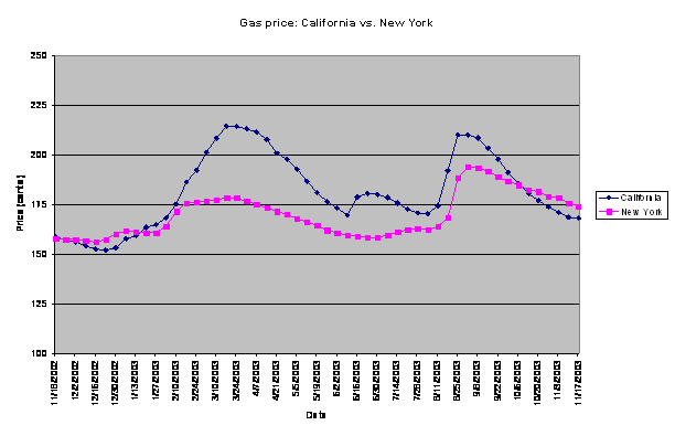
The line graph shows much more volatility in the price of California gas compared to the New York price. The California price spiked noticeably from the end of January to the end of March, 2003, while the New York price was in a much slower, more moderate rise.
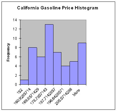
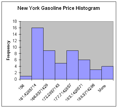
The histograms, like the line graph, show the volatility in the price of gasoline in California. The California histograms bars represent a fairly wide range in price and there is high frequency at just about each price. The New York histogram is somewhat skewed right.
Data comparison
The use of confidence intervals helps to compare the mean gasoline price difference between California and New York (at 95% confidence):
The mean price for California for the period ranged from $1.764 to $1.865
For New York $1.670 to $1.729
Computing the difference of the means (again at a 95% confidence level):
The mean price of California gas is from 6 to 17 cents higher than the price in New York.
Paired data hypothesis test
Ho: µ1=µ2 H1: µ1≠µ2
The critical z value for a two-tailed test at α = .05 is + or - 1.96. The results of the test: a z-stat of 3.869 with a p-value of .0001, can reject H0, and accept H1.
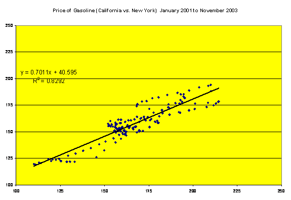
I can say that there is a difference in the mean gasoline price in California vs. New York, but is there a relationship in the prices? If the price goes up in California, does it go up proportionately in New York? A hypothesis test on the slope begins with a scatter diagram of the data. Ho: r = 0, H1: r ≠ 0
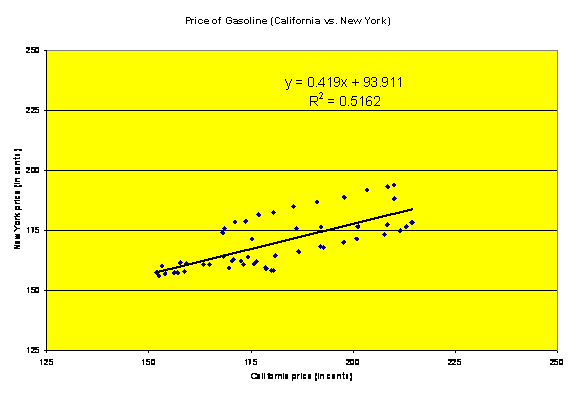
The scatter diagram shows a moderate correlation between the gasoline prices of California and New York. Further analysis of the data will give more detail.
One measurement that can be used is the correlation coefficient r. r can be used to show the strength of the linear association between two variables (California vs. New York gas price). An r of 1 or negative 1 means there is a perfect linear relationship and all points will fall on the least-squares line. The r value for this project = .718466
r can be put into better perspective by squaring. r2 for the gasoline data = .5162 and means that 52 percent of the variation of the y variable (New York gasoline price) can be explained by the corresponding variation of the x variable (California gasoline price). The remaining 48 percent variation is unexplained and is the result of variables besides the influence x may have on y. I would have expected greater correlation in the price, again the volatility in the California price is much higher than any volatility in New York.
The slope of the least-square line can be illustrated with the equation y = a + bx. The slope b is the number of units y changes for each unit that x changes. The equation for the gasoline data is y = .419x + 93.911. The equation can be used to predict y (New York gasoline price) for a given x (California gasoline price). Example: the price of gasoline in California is $1.97 per gallon (197 cents), using the formula .419 x 197 + 93.911= 176.454; so, if the price of California gas is $1.97, we can predict New York gasoline to be about $1.76. Setting up a confidence interval for y at a specific value for x, again using $1.97, at 95% confidence (E= 15.53), the price in New York would fall into the $1.61 to $1.92 range.
This project covers a period of one year, with fifty-three pairs of data. The data was interesting in the way it showed the volatility in the price of gas in California, but gives the false indication that the California price is much higher than New York's with only moderate correlation. If I manipulate the data and use thirty pairs of data, the first fifteen weeks and the last fifteen weeks of the period, the results are quite different.
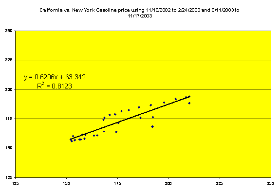
r2 is now .8123 compared to .5162 for the entire period. The inclusion of data beginning January 2001, provides the following scatter diagram and statistical results:
r2 has increased even more. What does this all mean? My project covered a period of just one year, a year that saw a couple of periods of crazy price spikes in California that for some reason did not occur to the same degree in New York. If I had used the additional data from prior years, the correlation in the price of gasoline in California and New York would have been much higher.
Sampling methodology and collection procedures
The sample for the Motor Gasoline Price Survey was drawn from a frame of 115,000 retail gasoline outlets nationwide using the Chromy allocation algorithm statistical technique. Every Monday, retail prices for all three grades of gasoline are collected by telephone from a sampling of approximately 900 retail gasoline outlets.[1]