The Normal Distribution and Control Charts
The Normal Distribution
There is a special distribution that we will use just about every day for the next month. It is a distribution for a continuous random variable that has the following properties:
- It is symmetric about the mean
- It approaches the horizontal axis on both the left
and right side without touching, that is the x-axis is a asymptote.
- It is bell shaped with transition points one
standard deviation from the mean.
- Approximately
68%
of the data points lie within one
standard deviation of the mean.
- Approximately
95%
of the data points lie within two
standard deviations of the mean.
- Approximately 99.7% of the data points lie within three standard deviations of the mean.
You can play with the graphs by going to
http://www-stat.stanford.edu/~naras/jsm/NormalDensity/NormalDensity.html
Example
You are the manager at a new toy store and want to determine how many Monopoly games to stock in you store. The mean number of Monopoly games that sell per month is 22 with a standard deviation of 6. Assume that this distribution is Normal.
A. What is the probability that next month you will sell between 10 and 34 games?
Solution
We notice that
22 - 2(6) = 10 and 34 = 22 + 2(6)
We want to know what the probability is that the outcome lies within two standard deviations of the mean. Property 5 says that this percent is about 95%.
B. If you stock 45 games, should you feel secure about not running out?
Solution
Since three standard deviations above the mean is
22 + 3(6) = 40
and 45 is above that, there is a less than 0.3% chance of running out. You should feel very secure.
Control Charts
We often want to determine if things are beginning to stray from the norm as time goes on.
Example
It has been determined that the mean number of errors that medical staff at a hospital makes is 0.002 per hour with a standard deviation of 0.0003. The medical board wanted to determine if long working hours was related to mistakes. During the day, the medical staff was observed to see when they made mistakes. The table illustrates the finding.
| Hours Worked | 1 | 2 | 3 | 4 | 5 | 6 | 7 | 8 | 9 | 10 |
| Mistakes per Hour | 0.0019 | 0.0022 | 0.0015 | 0.0017 | 0.0020 | 0.0022 | 0.0018 | 0.0028 | 0.0019 | 0.0027 |
It is difficult to see a trend from just looking at the table. Instead, we will create a chart that better illustrates the trends.
We call the system out of control if at least one of the three events occur
Out of Control Signal 1: At least one point falls beyond the 3s level.
Out of
Control Signal 2: A run of nine
consecutive points is on the same side of the
center line (usually the mean).
Out of
Control Signal 3: At least two of three
consecutive points lie beyond the 2s level
on same side of the center line (usually the mean).
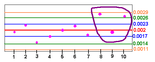
For our example we have
m + s = 0.002 + 0.0003 = 0.0023 m - s = 0.002 - 0.0003 = 0.0017
m + 2s = 0.002 + 0.0006 = 0.0026 m - 2s = 0.002 - 0.0006 = 0.0014
m + 3s = 0.002 + 0.0009 = 0.0029 m - 3s = 0.002 - 0.0009 = 0.0011
We now graph the points on a control chart.

We can see that two of the last three data points lie beyond two standard deviations above the mean. This gives out of control warning signals. The information should make the hospital administration weary about long hours.
Back to the Probability Home Page
Back to the Elementary Statistics (Math 201) Home Page
Back to the Math Department Home Page
e-mail Questions and Suggestions