Bar Charts, Frequency Distributions, and Histograms
Frequency Distributions, Bar Graphs, and Circle Graphs
The frequency of a particular event is the number of times that the event occurs. The relative frequency is the proportion of observed responses in the category.
Example: We asked the students what country their car is
from (or no car) and make a tally of the answers. Then we computed
the frequency and relative frequency of each category. The relative
frequency is computed by dividing the frequency by the total number of
respondents. The following table
summarizes.
| Country | Frequency | Relative Frequency |
| US | 6 | 0.3 |
| Japan | 7 | 0.35 |
| Europe | 2 | 0.1 |
| Korea | 1 | 0.05 |
| None | 4 | 0.2 |
| Total | 20 | 1 |
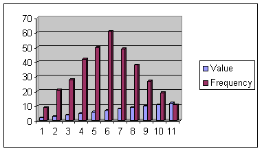
Below is a bar graph for the car data. This bar graph is called a Pareto chart since the height represents the frequency. Notice that the widths of the bars are always the same.

We make a circle graph often called a pie chart of this data by placing wedges in the circle of proportionate size to the frequencies.
Below is a circle graph the shows this data.

to find the angles of each of the slices we use the formula
Frequency
Angle
=
x 360
Total
For example to find the angle for US cars we have
6
Angle =
x 360 = 108 degrees
20
Histograms are bar graphs whose vertical coordinate is the frequency count and whose horizontal coordinate corresponds to a numerical interval.
Example:
The depth of clarity of Lake Tahoe was measured at several different places with the results in inches as follows:
15.4, 16.7, 16.9, 17.0, 20.2, 25.3, 28.8, 29.1, 30.4, 34.5,
36.7, 39.1, 39.4, 39.6, 39.8, 40.1, 42.3, 43.5, 45.6, 45.9,
48.3, 48.5, 48.7, 49.0, 49.1, 49.3, 49.5, 50.1, 50.2, 52.3
We use a frequency distribution table with class intervals of length 5.
| Class Interval | Frequency | Relative Frequency | Cumulative Relative Frequency |
| 15 -<20 | 4 | 0.129 | 0.129 |
| 20 -<25 | 1 | 0.032 | 0.161 |
| 25 -< 30 | 3 | 0.097 | 0.258 |
| 30 -< 35 | 2 | 0.065 | 0.323 |
| 35 -< 40 | 6 | 0.194 | 0.516 |
| 40 -< 45 | 3 | 0.097 | 0.613 |
| 45 -< 50 | 9 | 0.290 | 0.903 |
| 50 -< 55 | 3 | 0.097 | 1.000 |
| Total | 31 | 1.000 |
Below is the graph of the histogram

The Shape of a Histogram
A histogram is unimodal if there is one hump, bimodal if there are two humps and multimodal if there are many humps. A nonsymmetric histogram is called skewed if it is not symmetric. If the upper tail is longer than the lower tail then it is positively skewed. If the upper tail is shorter than it is negatively skewed.
 Unimodal,
Symmetric, Nonskewed
Unimodal,
Symmetric, Nonskewed
 Nonsymmetric,
Skewed Right
Nonsymmetric,
Skewed Right
 Bimodal
Back to the Descriptive Statistics Home Page
Back to the Elementary Statistics (Math 201) Home Page